
 Pseudoelements, pseudoselectors, and nesting
styled-components에서 가상요소 선택자,가상요소, 중첩을 이용할때 Sass문법문법인 ‘&’를 사용한다.
•
단일 ‘&’ 인 경우
◦
구성요소의 모든 인스턴스를 나타낸다.
◦
가상요소 선택자, 가상요소, 중첩이 가능하다.
◦
예시
const UniAfter = styled.div`
&:after {
content: "!!";
}`
JavaScript
복사
const Thing = styled.div.attrs((/* props */) => ({ tabIndex: 0 }))`
color: blue;
//가상 클래스 선택자
&:hover {
color: red; //<Thing>요소에 hover시 색이 red로 변한다.
}
//형제 선택자
& ~ & {
background: tomato; // <Thing>아래에 있는 형제인 모든 <Thing>요소를 선택한다.
}
//형제 선택자
& + & {
background: lime; // <Thing>다음의 <Thing> 요소를 선택
}
&.something {
background: orange; //".something"클래스를 가지는 <Thing>
}
.something-else & {
border: 1px solid; // ".something-else"인 클래스명을 가지는 요소 내부의 <Thing>을 선택
}
`
render(
<>
<Thing>Hello world!</Thing>
<Thing>How ya doing?</Thing>
<Thing className="something">The sun is shining...</Thing>
<div>Pretty nice day today.</div>
<Thing>Don't you think?</Thing>
<div className="something-else">
<Thing>Splendid.</Thing>
</div>
</>
)
JavaScript
복사
•
‘&&’ 일때
◦
구성 요소의 인스턴스를 나타낸다
◦
이는 조건부 스타일 적용한다.
◦
특정 구성 요소의 모든 인스턴스에 스타일을 적용할 필요가 없을 때 사용한다.
◦
예시
const Thing = styled.div`
&& {
color: blue;
}
`
const GlobalStyle = createGlobalStyle`
div${Thing} {
color: red;
}
`
render(
<>
<GlobalStyle />
{/*blue로 출력*/}
<Thing>
I'm blue, da ba dee da ba daa
</Thing>
</>
)
JavaScript
복사
•
‘&’없이 선택자를 사용하는 경우
◦
요소의 하위 항목을 선택하고 싶을 때 하위 항목에 해당하는 클래스 선택자를 사용한다.
◦
셀렉터가 구성 요소의 하위 항목을 참조한다.
◦
예시
const Thing = styled.div`
color: blue;
.something {
border: 1px solid; // an element labeled ".something" inside <Thing>
display: block;
}
`
render(
<Thing>
<label htmlFor="foo-button" className="something">Mystery button</label>
<button id="foo-button">What do I do?</button>
</Thing>
)
JavaScript
복사
Attaching additional props
•
스타일에서 html의 attribute를 설정 할 수 있다.
•
attrs는 attribute를 삽입하기 위한 메서드이다.
•
attrs을 사용하여 inline-style을 지정 할 수 있다.
•
원하는 style에 따라 html의 속성이 변하지 않을 때 사용하면 유용하다.
◦
type
◦
inline-style
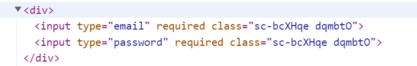
const Input = styled.input.attrs({required:true})`
`
function A (){
return (
<div>
<Input type='email'/>
<Input type='password'/>
</div>
)
}
JavaScript
복사
•
attrs속성은 overriding이 된다.
const Input = styled.input.attrs(props => ({
type: "text",
size: props.size || "1em",
}))`
border: 2px solid palevioletred;
margin: ${props => props.size};
padding: ${props => props.size};
`;
// Input's attrs will be applied first, and then this attrs obj
const PasswordInput = styled(Input).attrs({
type: "password",
})`
// similarly, border will override Input's border
border: 2px solid aqua;
`;
render(
<div>
<Input placeholder="A bigger text input" size="2em" />
<br />
{/* Notice we can still use the size attr from Input */}
<PasswordInput placeholder="A bigger password input" size="2em" />
</div>
);
JavaScript
복사
attrs 오버라이딩이 되기 때문에 input type이 text인 요소와 password인 요소가 출력된다.
Animations
@keyframes가 포함된 CSS 애니메이션은 단일 구성 요소로 범위가 지정되지 않는다. @keyframes을 글로벌하게 만들면 충돌이 야기될 수 있다. 따라서 앱 전체에서 사용할 수 있는 고유한 인스턴스를 생성하는 keyframes helper 를 사용한다.
keyframs helper 사용 방법
// keyframes 생성
const rotate = keyframes`
from {
transform: rotate(0deg);
}
to {
transform: rotate(360deg);
}
`;
// 2초 동안 통과하는 요소를 회전시키는 구성 요소를 생성
const Rotate = styled.div`
display: inline-block;
animation: ${rotate} 2s linear infinite;
padding: 2rem 1rem;
font-size: 1.2rem;
`;
render(
<Rotate>< 💅🏾 ></Rotate>
);
< 💅🏾 >
Plain Text
복사
키 프레임은 대응 네이티브에서 지원되지 않는다.
const rotate = keyframes``
// ❌ erro
const styles = `
animation: ${rotate} 2s linear infinite;
`
// ✅
const styles = css`
animation: ${rotate} 2s linear infinite;
`
Plain Text
복사
Theming
스타일 구성 요소는 <ThemeProvider> 래퍼 구성 요소를 내보내 전체 테마 지정을 지원합니다. 이 구성 요소는 컨텍스트 API를 통해 자체 아래의 모든 React 구성 요소에 테마를 제공합니다. 렌더링 트리에서 스타일이 지정된 모든 구성 요소는 여러 수준 깊이에 있더라도 제공된 테마에 액세스할 수 있습니다.
:) 버튼 구성요소 예시
// Define our button, but with the use of props.theme this time
const Button = styled.button`
font-size: 1em;
margin: 1em;
padding: 0.25em 1em;
border-radius: 3px;
/* Color the border and text with theme.main */
color: ${props => props.theme.main};
border: 2px solid ${props => props.theme.main};
`;
// We are passing a default theme for Buttons that arent wrapped in the ThemeProvider
Button.defaultProps = {
theme: {
main: "palevioletred"
}
}
// Define what props.theme will look like
const theme = {
main: "mediumseagreen"
};
render(
<div>
<Button>Normal</Button>
<ThemeProvider theme={theme}>
<Button>Themed</Button>
</ThemeProvider>
</div>
);
JavaScript
복사
Function themes
You can also pass a function for the theme prop. This function will receive the parent theme, that is from another <ThemeProvider> higher up the tree. This way themes themselves can be made contextual.
This example renders our above themed Button and a second one that uses a second ThemeProvider to invert the background and foreground colors. The function invertTheme receives the upper theme and creates a new one.
// Define our button, but with the use of props.theme this time
const Button = styled.button`
color: ${props => props.theme.fg};
border: 2px solid ${props => props.theme.fg};
background: ${props => props.theme.bg};
font-size: 1em;
margin: 1em;
padding: 0.25em 1em;
border-radius: 3px;
`;
// Define our `fg` and `bg` on the theme
const theme = {
fg: "palevioletred",
bg: "white"
};
// This theme swaps `fg` and `bg`
const invertTheme = ({ fg, bg }) => ({
fg: bg,
bg: fg
});
render(
<ThemeProvider theme={theme}>
<div>
<Button>Default Theme</Button>
<ThemeProvider theme={invertTheme}>
<Button>Inverted Theme</Button>
</ThemeProvider>
</div>
</ThemeProvider>
);
JavaScript
복사
Getting the theme without styled components
via withTheme higher-order component
If you ever need to use the current theme outside styled components (e.g. inside big components), you can use the withTheme higher order component.
import { withTheme } from 'styled-components'
class MyComponent extends React.Component {
render() {
console.log('Current theme: ', this.props.theme)
// ...
}
}
export default withTheme(MyComponent)
JavaScript
복사
